Custom Portfolio

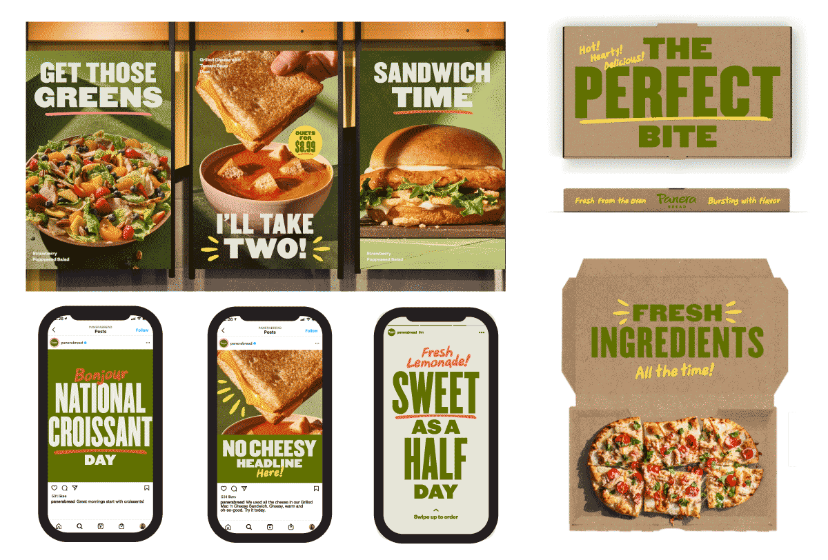
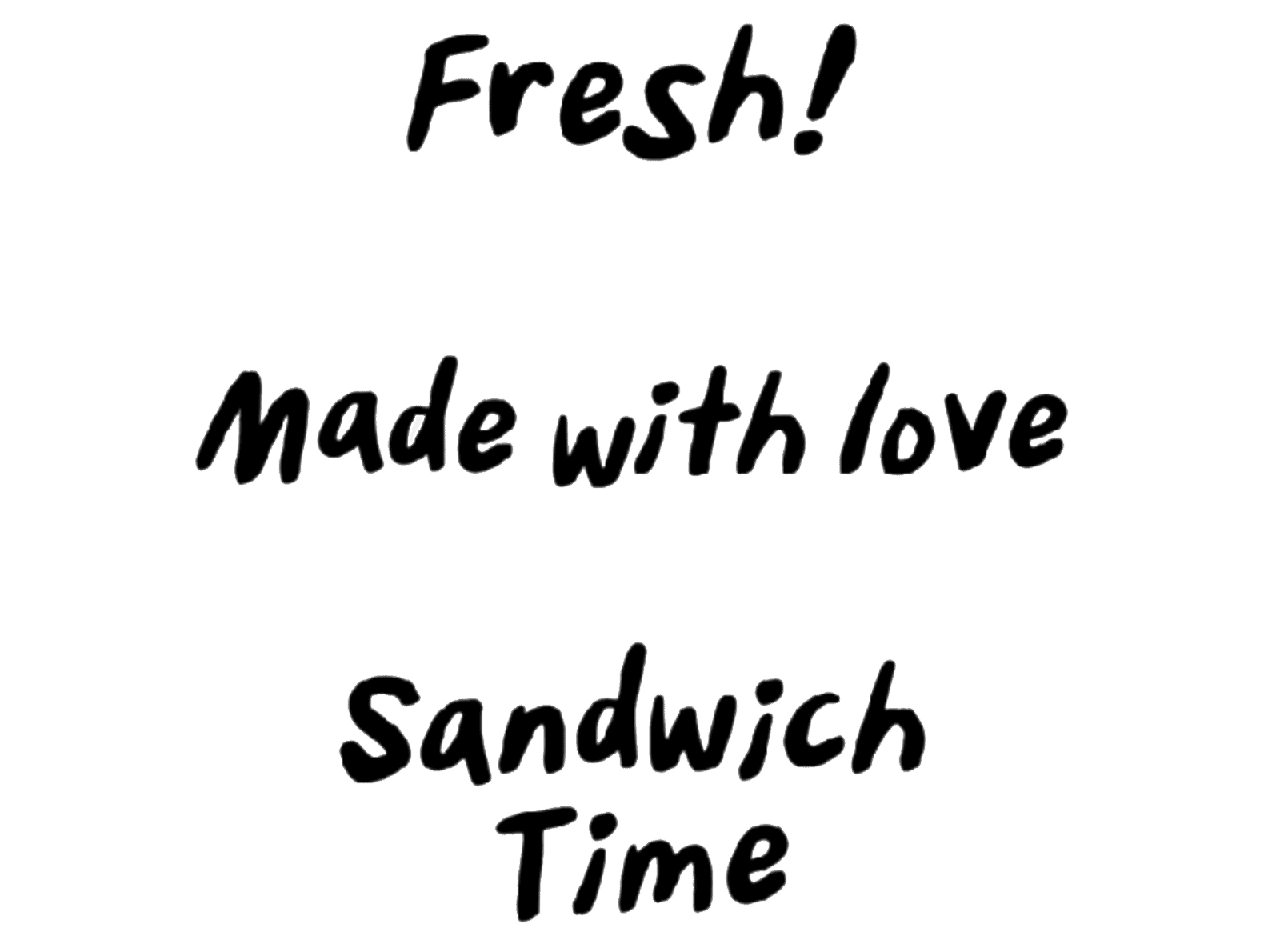
A robust variable font with the organic qualities of handwriting

Starter Script is a handwriting script for Panera Bread, bringing a friendly yet polished feeling to their branding. We developed a custom variable font to offer optimized legiibility in a wide range of uses.

Panera Bread
Agency: Jones Knowles Ritchie

Project Brief

We were approached to collaborate again with agency Jones Knowles Ritchie to make a typeface for Panera Bread. The team at JKR was creating a vibrant, energetic rebrand across print and digital media and had drawn a custom alphabet that they were hand-setting internally. We collaborated with them to make it into a digital typeface, as well as expand it into a variable font with an optical size axis so that it may be used in a broader range of applications.

Starting alphabet by the client
Sample usage scenarios, including storefront large posters, packaging, and instagram posts, provided by JKR.

Design Inspiration

This typeface came together rather quickly once we got going. We collaborated with JKR to nail the precise level of bounciness and variation in forms to echo the feeling of handwriting. There are very many decisions that go into creating letters that looks casual and quick.

Original sample lettering from JKR
Working phrases, in both Big and Small styles
Working phrases, shown here in both Big and Small styles. We preserved the casual bounciness while smoothing out uneven textures and inconsistencies.

Process

The character set includes two sets of alternates for both the lowercase and uppercase, which automatically cycle through each other via default OpenType feature. This makes it relatively believable as handwriting, especially as it is often used for emphasis or short phrases.

We discussed some modifications from the original sample to ensure the different versions preserved the same “hand” and maintained its unique rhythm.

Each character has 3 versions that are automatically cycled through as an embedded feature. These can also be manually accessed through stylistic alternates.

Features

At one end of the optical size axis is Starter Script Big, which has a bouncy baseline, quirky idiosyncrasies between alternate glyphs, and lets its personality shine in larger callout phrases. Starter Script Small, at the other end of the axis, is bolder so that it meshes nicely with large phrases, with a taller, more readable x-height and looser spacing to withstand being set smaller.

Some design programs are very recently integrating the variable size axis as an automatically deployed feature, so for example when a user sets text in Starter Script at 64pt, it will use the Big version, then if they change the size to 18pt, the typeface will show up as the Small version.

Fresh!
Starter Script animation across optical size

Additional Features

We also included a feature of a handful of variable underlines, so that JKR and their client Panera would be able to set exactly the length of underline they need for a given graphic.

-
-
-
Starter Script Underline Variable, with three variations.
The variable width underline can pair with words of any length

In Use

Starter Script is unpretentious yet confident, lending a lively flourish to all applications from physical menu boards to social media graphics. We’re very pleased to have an opportunity to create a variable font and show our clients the exciting possibilities of this relatively new technology.

Starter Script used on a social media campaign.
Starter Script and Underline used on a social media campaign.
Starter Script in used in storefront posters, signage, and ad-hoc announcements in the Panera in downtown Providence, RI.