A performative variable font for a new art journal’s visual identity
Movements Variable is a structural typeface that fluidly animates across slant and weight, in response to Brown University’s newly-built performing arts center.

Movements Variable is a structural typeface that fluidly animates across slant and weight, in response to Brown University’s newly-built performing arts center.
On October 27, 2023, the Brown Arts Institute at Brown University launched a new publication, Movements Journal. It explores the purpose and power of contemporary art criticism, poetics, and theory. Occupant Fonts was approached to design a custom display face that could capture its experimental spirit. The resulting typeface was named Movements, after the publication name.
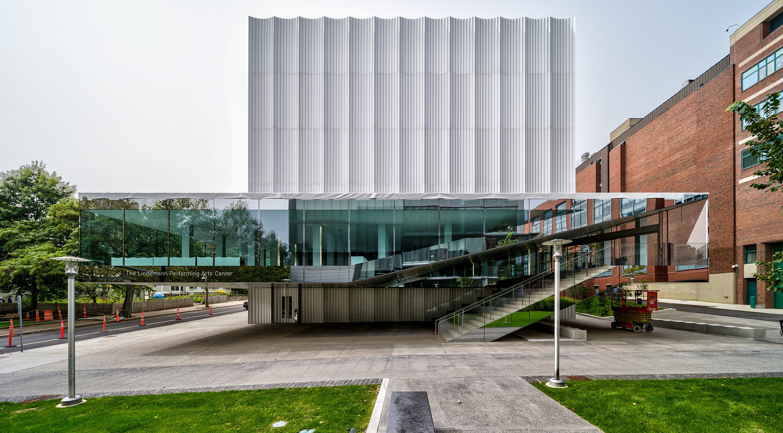
The launch of Movements was driven by the opening of the new Lindemann Performing Arts Center, designed by the architecture firm, REX. The exterior features reflective aluminum flutes that evoke the drapes of a curtain that open and close performances. Its interior spaces are constructed to be modular and flexible according to the facility’s various needs. These architectural qualities inspired the systematic yet fluid structure of the custom typeface.
Each letter has a modular design and was built using a single component similar to traditional pixel font construction. However, instead of the usual square unit, Movements is built using elongated rectangular modules. This makes the resulting letters more condensed and more suitable for headlines.
The italics were inspired by how light cascades off the building’s façade. Instead of skewing the upright roman version, the modules were staggered to create a slanted effect.

Although the thinnest hairline weight is barely visible when small, we found it useful at very large headline sizes. The heavier weights are more suited for use at text sizes. As a variable font, the extreme weight axis works very well in animation.
As a typeface intended for an arts journal featuring a global audience, Movements Variable supports a large number of languages with its extended Latin character set.


Layering the different styles of the typeface together, along with animation, provides opportunities for expressive color effects.
At large sizes, the typeface can be used as part of a toolkit for form-making. We hope this typeface continues to support the voices of multi-disciplinary artists featured on the Movements art journal. You can access the publication here.