Custom Portfolio

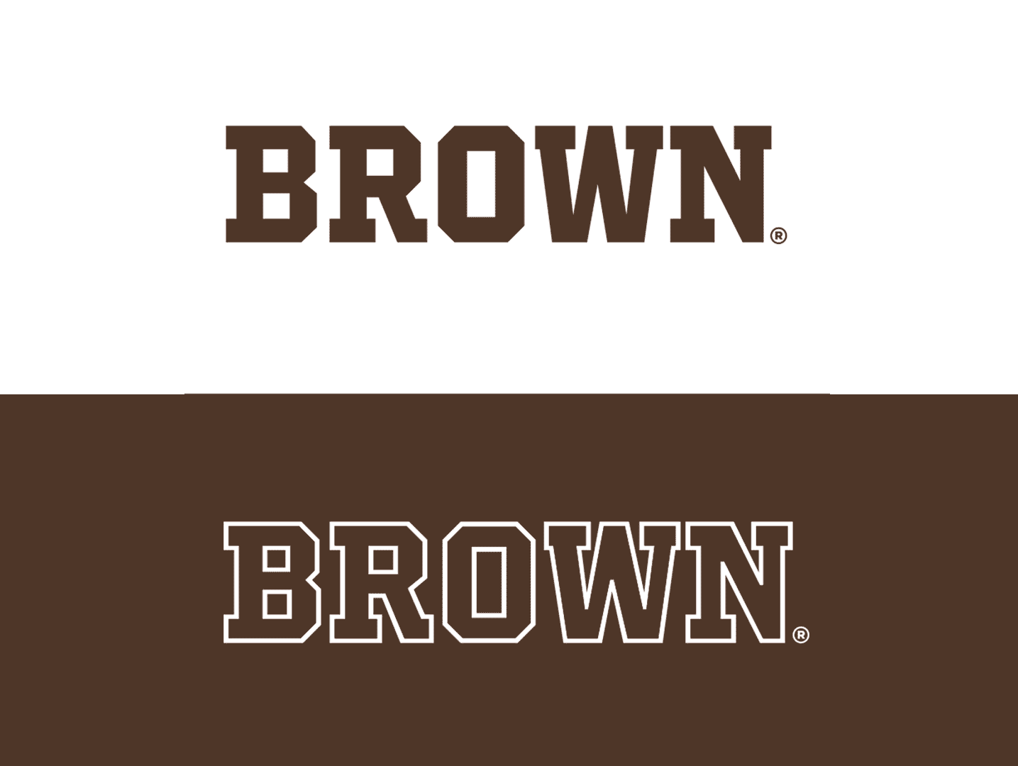
A refined take on collegiate letters

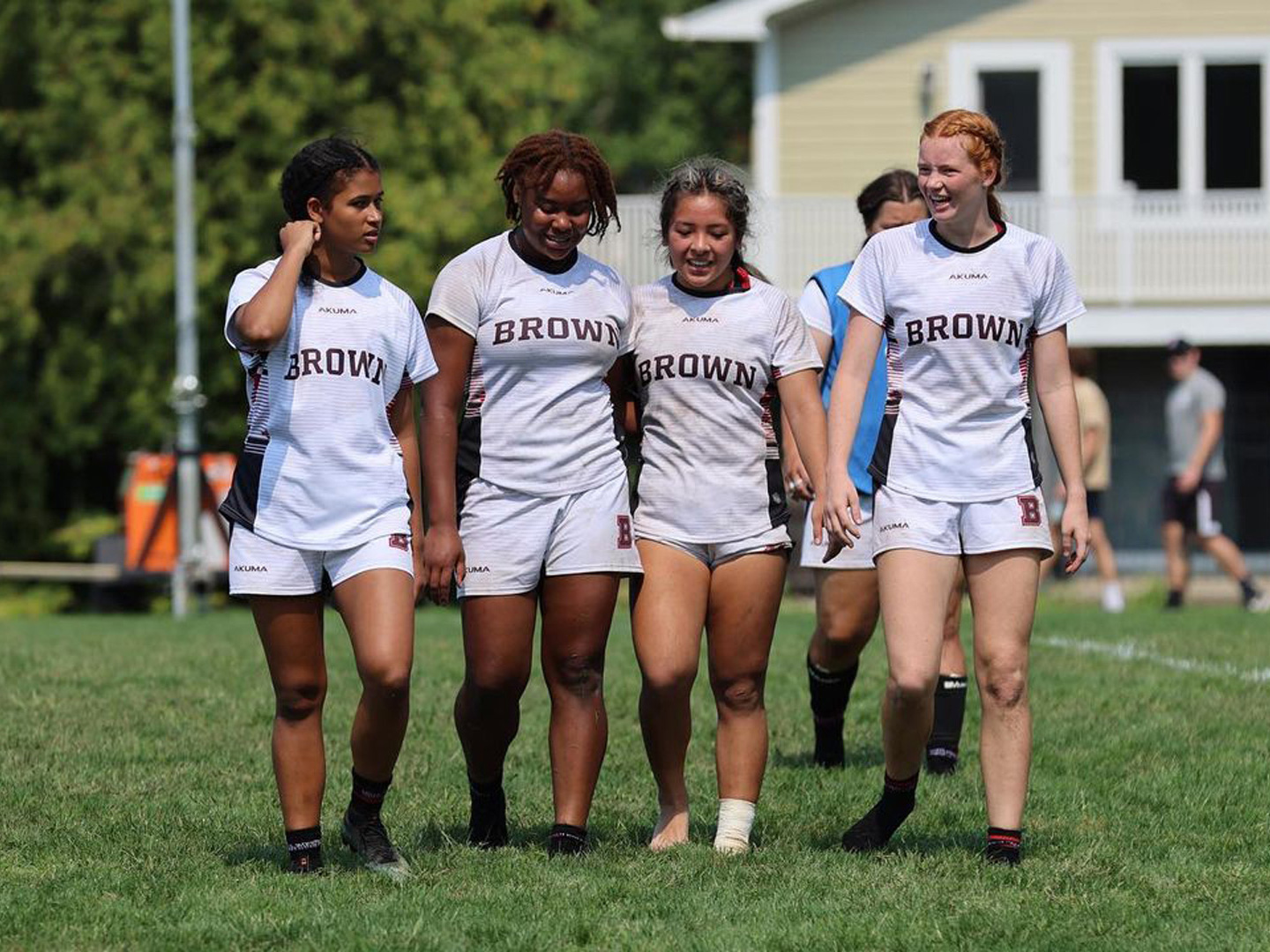
We created a custom font in two styles for Brown University Athletics’ wide range of applications in apparel, signage, and screens, with language support appropriate for the university’s international community. We also provided refinements to the department’s existing wordmarks to align better with the new typeface.

Brown University Athletics

Project Brief

We were asked by Brown University Athletics to finalize their new logotype, and to create an accompanying pair of display typefaces to be the voice of their updated identity in both digital communications and printed merchandise. Brown University Athletics had internally created a diverse palette of new logotypes and monograms, and enlisted our expertise to take them over the finish line.

Two adaptations of the monogram
Two adaptations of the monogram, outline and arched solid.

Design Inspiration

Brown University Athletics was looking for a collegiate typeface based on their monogram of the letter B. In designing the typeface, we also refined and streamlined the variety of their existing wordmarks.

Various lockups of the Brown Athletics monogram and wordmarks.
Various lockups of the Brown Athletics monogram and wordmarks that were streamlined to be consistent with the custom typeface.

Process

We created a limited character set of only capital letters, numbers, and basic punctuation, with broad language support to accommodate Brown’s international community. We started with a solid version of the typeface, creating a familiar but fresh take on the classic font-for-sports: slab-serif, angular, and octagonal. Its job is to be easily combinable with and flattering to the family of logotypes.

Brown Athletics Key Phrases
We exported lockups of key brand phrases early in the process while the full character set was developed.

Process

We took the solid typeface and created an outline version, re-drawing and re-spacing as necessary. We considered making the styles usable on top of one another to mimic the effect of a multi-colored font. But that would mean that neither of them would look as good standing alone, and after discussing the options with the client, we all agreed instead to give each of the two styles their best color and spacing individually. So while they cannot be stacked on top of one another, they each shine as individuals.

Creating an outline typeface is a bit more involved than simply using an automated tool. Each contour needs to be finely tuned to give the illusion of a monoweight outline.

Overlay of Brown Bears Solid and Outline
Overlaid comparison between solid and outlined styles. We refined the stroke weights, widths, and spacing of the outline version so that it can be used as a stand-alone style.

In Use

The horizontal monograms are based on the custom typeface, modified ever so slightly for the best lockup. Complete with the singular B mark, arched wordmarks, solid and outline typefaces, Brown University can design an extensive array of apparel for their athletes.

This logotype family and pair of display typefaces are to be used across environments and physical signage, as well as both internal and external communication materials.

Brown wordmark on team uniforms tops, with the primary B used on the bottoms. Courtesy of Brown University Athletics.
Primary B wordmark on the floor of the University gym.
Updated monogram used large in the University gym. Courtesy of Brown University Athletics.
Courtesy of Brown University Athletics
Wordmark and solid custom font used on apparel. Courtesy of Brown University Athletics.